
Bowmans · Inspiration · Tiles
Luxury bathroom tiles: are they worth it? 7 checks before you buy
By Jonathon Barclay · · 21 min read
If you’ve seen a marble-effect porcelain online at one price and something that looks much the same at a far higher one, the obvious question is whether you’d ever see the difference once it’s on the wall. Sometimes you would, and you don’t have to take anyone’s word for it. Luxury bathroom tiles are worth the extra only when the price buys things you can check before you order: rectified edges, the calibre, the shade, the number of faces, the body of the tile, how flat it is and the slip figure for a wet floor.
Price on its own proves nothing. A cheap tile and an expensive one can look identical on a screen, and a dearer tile whose seller can’t get you answers on those seven checks isn’t the one we’d choose. This guide takes each check in turn: what it changes in the finished room, and where to find it on the datasheet, the box or a set of full-size samples.
Expensive bathroom tiles are worth it when the extra money buys things you can check: rectified edges, one calibre and one shade, enough different faces that the pattern doesn’t visibly repeat, the right body for the job, a flat surface and a wet-floor slip figure. They aren’t worth it when the only difference is the name on the box.
Quick Navigation
Why are some tiles more expensive than others?
There isn’t a single reason, and some of the reasons never show on the wall. A tile’s price reflects the design, the brand, how it’s made and how it’s sold, and we can’t honestly tell you how much of any one price belongs to which. The one manufacturing difference we can point to is rectifying, which is an extra step after the tile has been fired.
So it’s more useful to turn the question round and ask what a dearer tile should be able to show you for the money. There are seven things. None of them comes automatically with a higher price, which is why each one is worth checking. They’re also how you tell a good quality tile, whatever it costs.
Swipe across to compare all columns.
| Check | What you see in the finished room | Where to find it |
|---|---|---|
| Rectified edges | Narrow, even grout joints | Datasheet or product page: “Rectified: Yes” |
| Calibre (size batch) | Joints that stay the same width along a wall | Code stamped on the box |
| Shade code and V rating | No banding or patchwork | Box label; V rating on the product page |
| Number of faces | No repeating vein or knot | Product page, or ask the supplier |
| Body (porcelain, ceramic, glazed, through-body) | How it copes with water and chips | Datasheet: water absorption group |
| Flatness | No lips catching low light on large tiles | Several full tiles laid side by side, viewed along the joint; your fitter’s opinion |
| Slip rating | Safe footing on a wet floor | Datasheet: PTV (wet) or ramp class |
We haven’t put prices in this guide. If you want the price bands, we’ve set out what bathroom tiling costs per square metre separately.
Rectified edges, calibre and the grout joint
Between them, these two decide how narrow and how even your grout joints can be. On a large marble-effect wall the joints are the only thing interrupting the veining, so they matter more than you might expect.
What rectified means
Fired tiles don’t all come out exactly the same size. A rectified tile has had its edges cut after firing, so the tiles match each other closely and the edges are square. That’s what allows a narrow, even joint. A non-rectified tile simply hasn’t had that cut, so its edges are as they left the kiln. Porcelanosa describes rectified tiles as those “whose edges are cut after firing”, and the look it’s describing is one of “barely visible joints”.
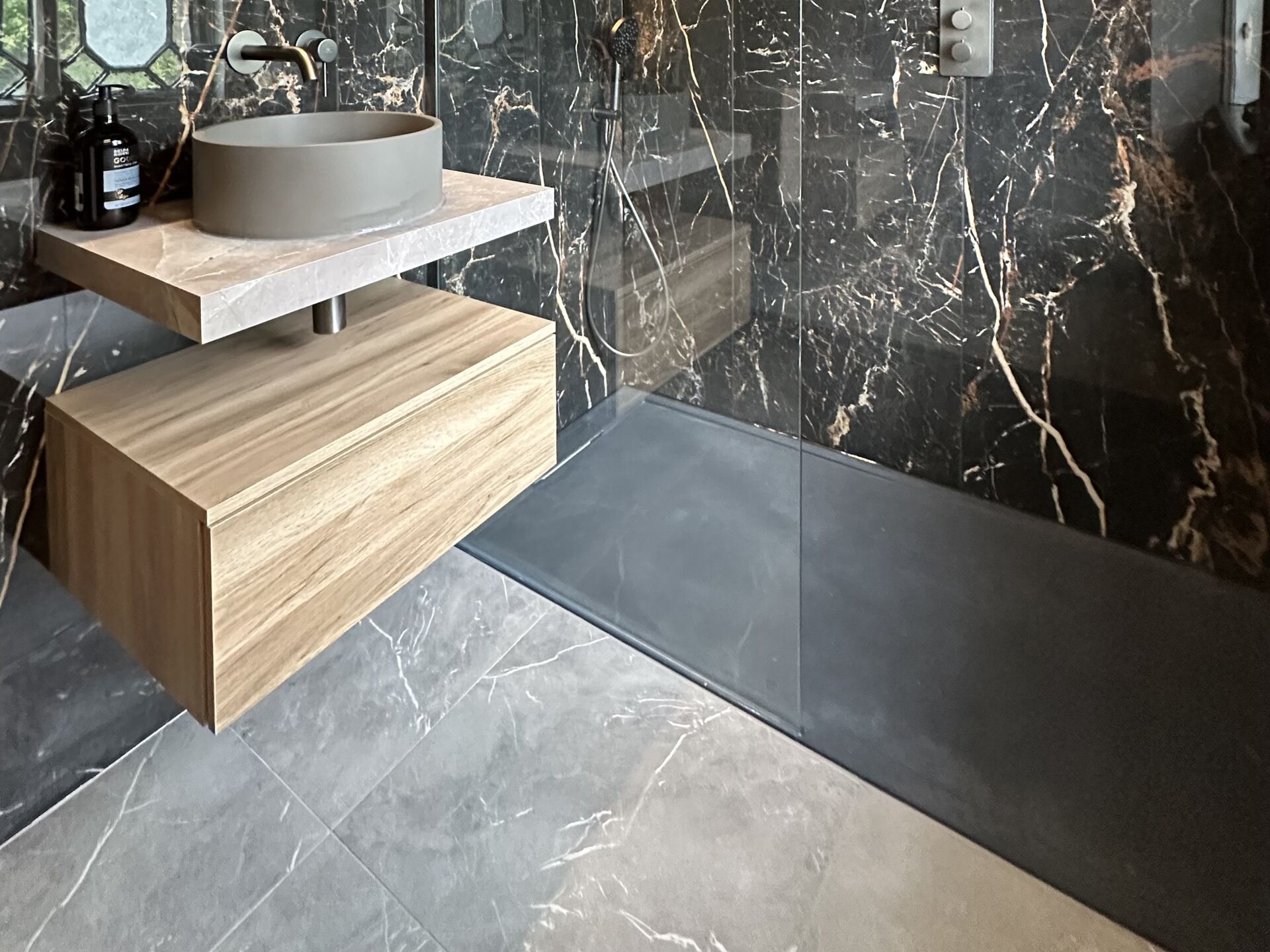
You can usually find it as a single line on the product page. Ca’ Pietra’s Marble Luxe Porcelain Laurant, for example, is listed as porcelain, “Rectified: Yes”, 120 x 60 x 1cm, polished, with no sealing required, for walls and floors in bathrooms, showers and wet rooms. It’s the tile on the walls of our Gosfield shower room, where it’s laid in 60 x 120cm sheets so the pattern carries across the room with very few joints, over a softer grey marble-effect porcelain floor.
Calibre
Tiles are also sorted into size batches. A manufacturer’s summary of the European tile standard explains that production sizes vary for technical reasons, so the size is coded and stamped on the box, and only boxes carrying the same code should be laid together. That size batch is often called the calibre, and you’ll also see it spelt caliber.
In the room, a mixed calibre shows as joints that don’t stay the same width along the wall. So when the tiles arrive, check that every box carries the same code before any adhesive is mixed. It’s a quick job, and a mismatch is much easier to sort out while nothing has been fixed.
Rectified does not mean no grout. Some online guides say rectified tiles can be laid with joints of 1.5mm or less. The Tile Association’s summary of BS 5385-1:2018, the code of practice for internal wall tiling, gives a minimum joint of 2mm for smaller tiles and at least 3mm for larger tiles up to 1200mm long. So a 60 x 120cm tile on a wall should have at least 3mm under that standard, and 2mm is the narrowest you should expect even with small wall tiles. That part of the standard covers wall tiling in normal internal conditions. For floors, your fitter works to the relevant standard and the tile maker’s instructions.
Don’t treat 3mm as a compromise. What you notice on a finished wall is a joint that changes width as it goes, and that comes back to the edges and the calibre far more than to the odd millimetre.
Shade, batch and pattern repeat: what to check before anything is fixed
Two of these are checked before you order: the variation grade and the number of faces, which come from the product page or the supplier. The shade code is checked when the boxes arrive, before the first tile goes on the wall. After that there’s very little anyone can do about any of them.
Shade code and batch
The shade code works in the same way as the calibre. The summary of the European tile standard linked under Calibre says the colour shade code is stamped on the box, that only identical shades give a uniform surface, and that tiles from different boxes should be mixed as they’re laid. Get it wrong and you see banding or patchwork: a block of tiles that looks slightly different from the ones beside it.
Ca’ Pietra’s advice on checking tiles before they’re laid is to open a box and view all the variations before installing, and where a tile has a lot of variation, to choose how each one is laid so you end up with an even mix.
The practical answer is to order the whole room in one go, with spares, because a top-up order a few months later may come from a different batch. If the same tile has to match across two rooms, order both rooms together for the same reason. Our guide to how much extra tile to order covers the allowance.
Shade variation: V ratings
Some manufacturers print a variation grade, which tells you how much one tile is meant to differ from the next. The scale runs from tiles that look almost identical to ones that vary heavily. Waxman Ceramics lists its Neo Travertine Natural Matt 60 x 120cm as a glazed porcelain, 10mm thick, in a matt finish, graded “V3 : Moderate Variation”.
Variation is something the designer of the tile chose, so don’t read a V3 as a fault. A stone effect wants some, because real stone isn’t uniform and a wall of identical tiles looks printed. A plain colour wants almost none. The grade isn’t something to pay more for. It tells you what’s going to arrive, so you can check it matches what you had in mind.
How many faces
A printed tile repeats. Each range has a set number of different prints, called faces, and the more faces there are, the less likely you are to spot the same vein twice on one wall.
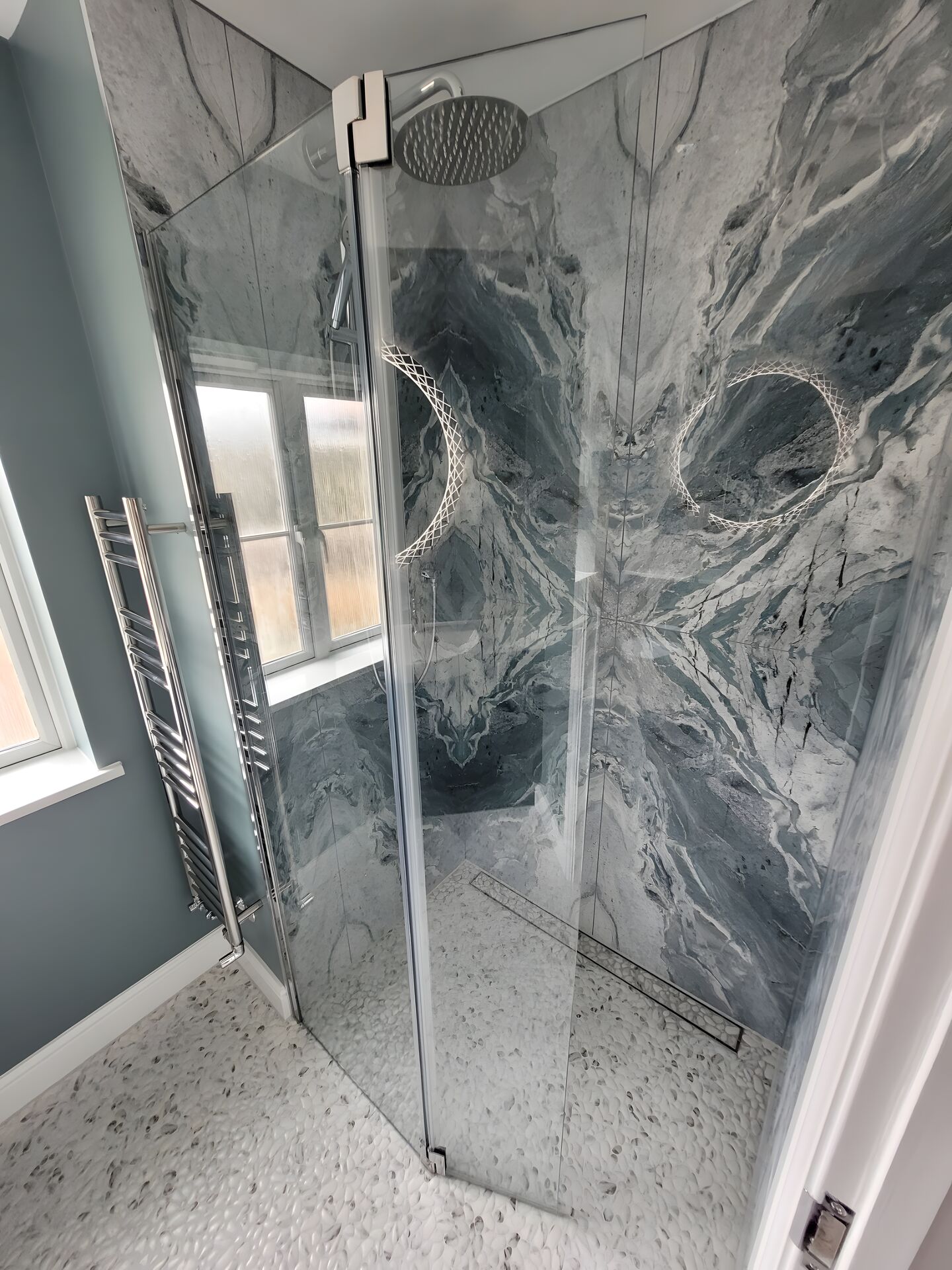
Ca’ Pietra publishes the number. Its Magnifique Porcelain Ocean lists 18 faces, and it’s rectified, 59.8 x 119.8cm and polished. There’s also a bookmatched version with an A tile and a B tile that pair up to mirror the veining. You can see those in our Highwoods wet-room ensuite in Colchester, where the bookmatched slabs are on the shower walls and the veining mirrors across the join.
We won’t give you a number of faces that counts as enough, because we don’t have a reliable one. What we’d do is ask the supplier how many faces the range has, then look at several full tiles side by side. One sample can’t show you a repeat. A handful of tiles on a table can, and if you spot it there you’ll spot it on the wall.
The body of the tile: porcelain, ceramic, glazed or through-body
The body decides where a tile can go. It has very little to do with how good the tile looks. On a datasheet, what separates one body from another is how much water it absorbs, and the European standard for ceramic tiles, BS EN 14411, groups dry-pressed tiles like this, with the percentages as set out in the manufacturer’s summary linked under Calibre:
| Group | Water absorption |
|---|---|
| BIa (porcelain) | Up to 0.5% |
| BIb | 0.5% to 3% |
| BIIa | 3% to 6% |
| BIIb | 6% to 10% |
| BIII (typical glazed wall tile) | Over 10% |
Porcelain is the most densely fired of these, which is why it takes up almost no water. We’d normally use it for floors and wet zones.
But a ceramic wall tile is a perfectly legitimate choice on a wall, and it’s where a lot of hand-glazed finishes are found. So a dearer porcelain isn’t automatically the right wall tile. If you’ve fallen for a glazed ceramic for the wall behind the basin, the absorption figure isn’t a reason to be talked out of it.
It also helps to know that the tile isn’t what keeps water out of the wall. That’s the job of the tanking behind it, and we’ve explained what bathroom tanking is in its own guide.
Glazed or through-body is a separate question. A glazed porcelain carries its design in the surface layer. A through-body tile is the same colour all the way through, so if an edge does get chipped it’s less obvious. Both are fine in a bathroom. It’s worth knowing which you’re buying if the tile is going somewhere an exposed edge might take a knock.
For the wider choice between porcelain, stone, marble or ceramic, see our buyer’s guide. And if what you really want is the real thing and not a marble effect, we’ve set out what a marble bathroom costs.
Flatness and large formats: what low light shows up
The bigger the tile, the more any raised edge shows. Where one tile sits slightly proud of the next, the lip catches the light from a window or a wall washer and you get a thin line of shadow along the joint. On a small tile you’re unlikely to notice. On a wall of large tiles lit from the side, you can.
A raised edge is partly down to the tile and partly down to what it’s fixed to. Keeping those edges level is why large-format porcelain can cost more to lay. The surface behind the tile has to be properly flat, the adhesive goes on both that surface and the back of the tile, and the fitter uses levelling systems and suction lifters to handle tiles of that size and weight.
The Tile Association’s guidance on large-format porcelain says large format tiles and panels should be laid to a surface regularity of at least SR1, tighter still for large panels, with adhesive on both the substrate and the back of the tile. Surface regularity is the trade’s term for how flat the wall or floor behind the tile is, and SR1 is a class your fitter will know. Porcelanosa’s large-format laying guide asks for a surface that’s “clean, dry, roughened, firm and flat”, then double-buttering (the same adhesive-on-both-surfaces method), levelling systems and double suction lifters to handle each tile. And the TTA’s summary of BS 5385-1:2018 mentioned earlier gives the example of 9mm porcelain tiles weighing more than 14kg, which it says should be solidly bedded whatever their size.
A rectified tile is normally chosen for a narrow, even joint, and keeping a joint narrow and even over a whole wall depends on the same things: a flat background, full adhesive contact and a levelling system. So a good large tile still needs a good fitter and a flat wall, and the fitting takes more care as the format grows. If your walls are old and uneven, get your fitter to look at the preparation before you settle on a bigger tile.
What you can do before ordering is ask to see several full tiles laid side by side on a flat surface, then look along the joints from a low angle, roughly the way light from a window would reach them. After that, ask your fitter what they think before you commit, because they’re the one who has to get the tiles flat on your wall. That’s our suggestion and not a formal test.
The shower floor: read the slip figure properly
On a floor that gets wet under bare feet, the slip figure matters more than anything else on this list, and a high price tells you nothing about it. Both of the polished marble-effect porcelains in this guide, Marble Luxe Laurant and Magnifique Ocean, are listed for walls and floors, and for bathrooms, showers and wet rooms. Neither product page showed a slip figure when we checked in September 2026.
The clearest account of what the figures mean is the Health and Safety Executive’s information sheet, Assessing the slip resistance of flooring. It’s workplace good-practice guidance, first published in May 2012, and it isn’t a regulation for private homes. It does explain the three figures you’re likely to see on a tile datasheet.
Swipe across to compare all columns.
| Figure on the datasheet | How it’s tested | What HSE says |
|---|---|---|
| PTV (pendulum test value) | Pendulum test, which is HSE’s preferred test | 0 to 24 is high slip potential, 25 to 35 moderate, 36 and above low |
| R9 to R13 | German ramp test (DIN 51130), done in cleated safety boots on motor oil | Floors classified R9, “or in some instances R10”, will be slippery when wet. R10 covers a very wide range of slip potential |
| A, B or C | Separate barefoot ramp test (DIN 51097) | A, and in many instances B, will be slippery when wet |
Two things follow from that. An R rating comes from a test in safety boots on oil, and HSE’s own comment is that R10 covers a very wide range. So “R10” on its own isn’t enough to go on for a floor you’ll stand on with bare, soapy feet. And whichever figure you’re given, it describes the tile as supplied. HSE points out that grouting, cleaning and wear can change it.
Ca’ Pietra’s published slip-rating guidance describes its R10 band as “medium friction. Suitable for internal domestic floors subject to occasional wetting, such as bathrooms.” A bathroom floor that gets splashed now and then is a different case from the floor of a walk-in shower or wet room, which is wet, soapy and walked on barefoot every day. For a walk-in shower or wet room floor, ask for the wet pendulum figure or the barefoot class rather than settling for “R10”. On the wet pendulum test, 36 and above is the band HSE calls low slip potential. That’s workplace guidance, but it’s the band we’d look for on a shower floor. On the barefoot test, keep in mind HSE’s comment that A, and in many instances B, will be slippery when wet.
It’s also why polished walls and a polished floor don’t have to go together. In the Highwoods ensuite, the polished bookmatched slabs are on the shower walls and the floor is a Porcelanosa Boulder pebble-effect tile, so the textured surface is the one you stand on and the polished one is on the wall.
Ask for the slip test figure before a polished tile goes on a shower floor. A tile can be listed for walls and floors, and for bathrooms, showers and wet rooms, and still show no slip figure on its product page. That only tells you the product page doesn’t cover it. It doesn’t tell you anything about the tile, so the supplier is the one to ask.
Where to spend and where a mid-range tile is fine
Spend where you’ll see one of the seven checks every day, and save where you won’t.
Spend here
- Large-format feature walls and shower walls seen under low light, where the edges, the flatness and the number of faces all show
- Bold marble effects, where the face count and a bookmatched pair decide whether the veining looks natural
- The wet-zone floor, where the slip figure comes first
Save here
- Small plain wall tiles, where there’s no print to repeat and a wider joint suits the look
- Surfaces that furniture or sanitaryware will mostly hide, where a repeat or a shade shift is out of sight
- Floors that play second fiddle to the walls, where a plainer tile has less pattern to repeat (still check the body and the slip figure)
- A non-rectified or hand-made look, where variation and a wider joint are the point
Verdict: are expensive tiles worth it?
Yes, where the seller can give you answers on the edge, the batch, the number of faces and the slip figure, and you’ll see the difference in the finished room. If they can’t get you those answers, the premium hasn’t been earned. If the budget is tight, we’d put the money into the shower walls and the shower floor and go plainer everywhere else.
Three tile brands we specify
We specify tiles from Ca’ Pietra, Porcelanosa and Waxman Ceramics. Here’s what each maker publishes about its tiles, and where Ca’ Pietra and Porcelanosa appear in our own projects.
Ca’ Pietra
Ca’ Pietra began in Devizes, Wiltshire, in 1989 as Artisans of Devizes, and the Ca’ Pietra name launched in 2009. It’s British and family owned. The range covers natural stone, porcelain, ceramic, terracotta and terrazzo. The product pages we checked publish whether a tile is rectified and, for Magnifique Ocean, the number of faces, which makes those lines easy to check. It’s the brand on the marble-effect walls in our Gosfield and Highwoods projects. See Ca’ Pietra tiles and stone at Bowmans.
Porcelanosa
Porcelanosa is a Spanish ceramic and porcelain tile maker, and it’s where we’d look for large-format and stone-effect porcelain. It publishes its own large-format laying guidance, which we’ve linked above. In our projects its Boulder pebble-effect tile appears on wet-room floors and a shower bench, including the West Mersea master ensuite, where a Boulder Black mosaic pebble bench sits alongside Ca’ Pietra Magnifique Nero bookmatched tiles. See Porcelanosa tiles and surfaces at Bowmans.
Waxman Ceramics
Waxman Ceramics has “over 40 years of experience in the tile industry” and supplies porcelain and ceramic wall and floor tiles. Its Neo Travertine, the glazed porcelain we looked at under shade variation, carries a published V3 variation grade, so you know before ordering how much the tiles will differ from one another. See Waxman Ceramics tiles at Bowmans.
In our showrooms the layout is planned and the products are chosen in the same sitting, so tile size, edging and niche detailing are settled before anything is ordered. Ask your designer for the datasheet, the batch details and the slip figure for any tile going on a wet floor, and order the whole room together with spares. Design is included, so you only pay for the products you choose. We design and supply, and we don’t install or manage the installation. You can use your own fitter, or we can introduce an approved one.
Frequently Asked Questions
See tile samples at our showrooms
If you’d like to compare tile samples side by side, book a showroom visit at Braintree or Leigh-on-Sea. If you’re buying tile for your own fitter, bring the room sizes and your fitter’s preferred joint width. And if you’re still working out what the whole room might come to, the price guide gives you a product range to start from.